Have you ever followed someone on Instagram almost instantly?
…one of the reasons for this might be because his/her whole Instagram page looks so damn amazing!
Have you ever wondered how do they make it so beautiful?
Guess what?
Here’s your chance of making your Instagram cohesive just like your favorite Instagrammer’s profile…
When someone comes across your profile you only have a few seconds to impress them to stay & follow you. And seconds aren’t enough to prove that you have a great personality or you have a good sense of humor.
What they see – is what they think you are!
And what do they see? Your bio and your feed. That’s what creates your first impression, right?
So having a killer bio and a consistent feed can get you lots of followers!
Disclosure: Some of the links are affiliate links, meaning, at no additional cost to you, I will earn a commission if you click through and make a purchase.
RECOMMENDED READING:
Now let’s talk about killer theme today…
To generate more interest to your profile visitors your Instagram feed should look visually appealing.
These are many ways to make your feed visually appealing. And here are some of them:
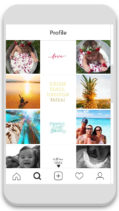
1. SINGLE COLUMN STRUCTURE
One column of quotes and the 2 columns can be switched between a promotion of your products/services and sharing your experiences (sharing experiences creates a connection between you and your followers).
If you’re a blogger, you can provide a column filled with tips and then for other 2 columns you can switch between a post promotion and a connection (your experience stories).
If you’re a beauty specialist use column for your client’s photos, one for testimonials and one for small tips.
If you’re a photographer, you can create the middle column filled with black and white photos and the side columns colorful.
Examples: @saltipineapple
2. ONE FILTER
Using just one filter or using the same presets of brightness, saturation, sharpness and contrast will make your feed look more put through. Look at the examples below from @igorjosif on the left and @athomewithashley on the right:

RECOMMENDED READING:
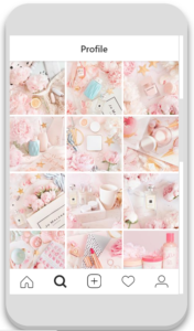
3. ONE COLOR THEME
Try to infuse one major color in all your pictures. Also, you need to snap all your pictures through one device. Don’t switch between cameras or mobile phones. It will ruin your theme.
Look at the example below from @fridayfaye
4. RAINBOW COLOR FEED
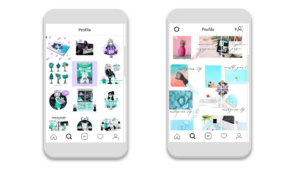
Using one color theme in minimum 3 pictures and then gradually changing it into another color and maintaining that for the other 3 pictures.
I am using this in my feed currently. If you see my pics, I’ve changed from gray to blue to pink and I’ll keep posting pink for a grid of 9 pics. My favorites: @eltrazodelulu on the left & my profile @vidzmak.insta.tips on the right.
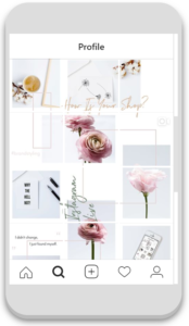
5. PUZZLE FEED
Use the whole feed to visualize a big picture by showing small parts of the whole feed picture in your single posts – This is called a PUZZLE feed. This is the hardest of all themes.
I’m also using this in my feed currently. Look at my feed above.
My other favorites are: @simplywhytedesign on the left & @white_space.studio on the right

RECOMMENDED READING:
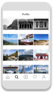
6. USING BORDERS AND FRAMES
These themes has become very easy to do if you are using @preview.app.
It provides easy ways to use the borders. Same kind of border in all your pictures makes this theme.
My favorite account is @ackishore
RECOMMENDED READING:
7. HYBRID THEME
Try combining any of the above themes to each other to create a completely unique theme.
I’ve combined rainbow theme and the puzzle theme.
Another example: @nordiccopperdesign.
You can also combine one color theme with one column theme, that’s the easiest hybrid theme.
8. USE WHITE SPACES
If your photos don’t create a consistent look then using some white space to make it “less messy” will make it cohesive.
I also use a lot of white spaces in my pics.
RECOMMENDED READING:
BONUS TIP
One thing that you need to make sure that your Instagram theme stays consistent is that you need to post high quality pictures. And most importantly, all your pictures need to be clicked from the same device to keep it consistent all over your Instagram profile and edited the same way. You don’t want to switch between different cameras or mobile phones.
You can either click them yourself, or hire a professional for your photos.
I don’t recommend using free stock photos if you want a really consistent feed and that is because you can’t get consistency when you are using pictures from different photographers. All will have different lighting, different camera and different setting and even different editing.
If you don’t have photographic skills and can’t afford to hire a photographer, here’s an affordable option for you: find someone who is selling really good High Quality images at an affordable price.
You may search for stock images on google and you’ll find many sites that provide images at affordable rates.
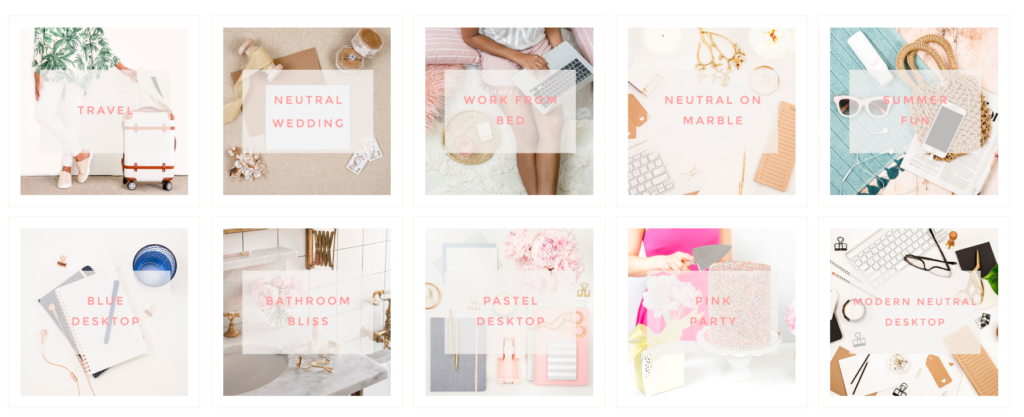
✅ Click here to check out my favorite stock photos.
My website is totally filled with these stock photos. With these, you can either buy individual stock bundles, or you can join their membership program which has quarterly, yearly and lifetime membership options.
According to me, the lifetime membership is really affordable. They add new images every week!
The best part of these images is that, they don’t look like stock images. You can use them as if they are your personal images (Use VIP10 to get a 10% OFF on your first purchase).
Have a look at their current bundles. Each and every type of image for every type of business!
Now that I’ve covered everything, I want you to go and check your feed.
Does every pictures go with each other?
Does your feed look cohesive?
Does it make anyone wanna keep scrolling down your feed?
If not, start doing this. Cz you don’t get another chance to convince your visitors to follow you! Do you?
1 Comment
[…] How to create consistent Instagram theme – 2x your Instagram Followers […]